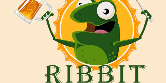
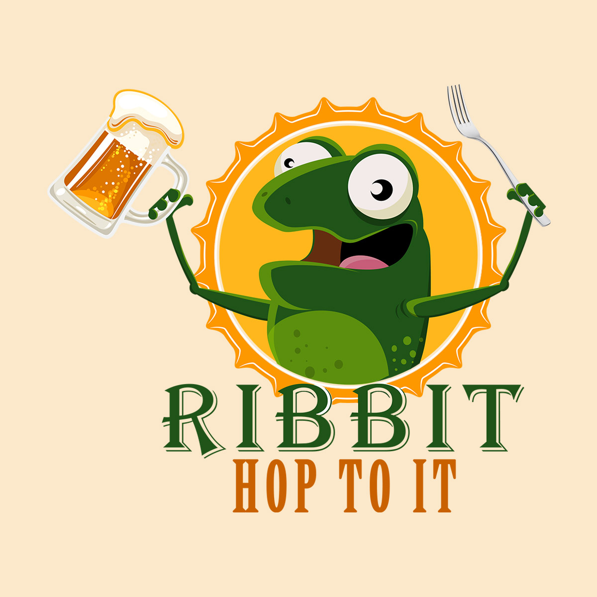
Ribbit is a food and drink sharing application. The initial design direction was slim to none, even after a standard discovery process. The key take-aways were that it had to be simple, color green, and a frog with utensils. Ultimately the client was provided with multiple compositions which were refined to produce the end product.
ARL Engineering
Logo Design
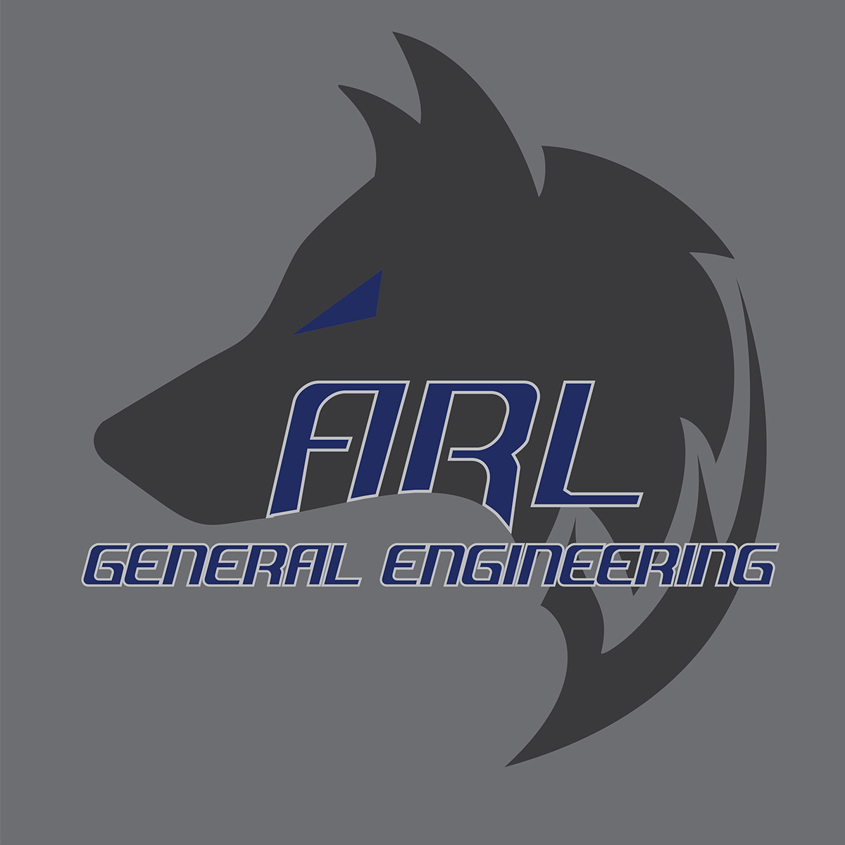
aantonopoulos@socal.rr.com 2023-04-12T08:09:42+00:00ARL Engineering provided very specific direction on the logo design and intended usage (Large and Small Format). Royal Blue and the wolf were a must with all other aspects left up to the designer. Clean lines, simplicity and tonal variance all play off one another. The final logo dives deep into the indicative nature of a business that provides meticulous engineering services.
Katerina’s Kitchen
Logo Design
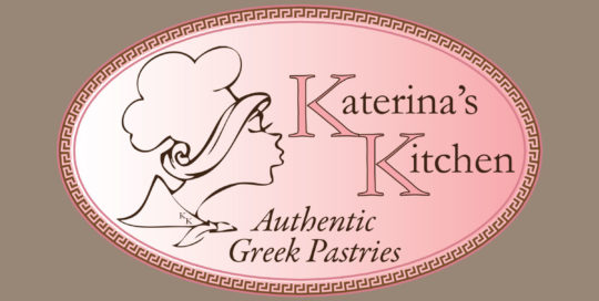
aantonopoulos@socal.rr.com 2017-05-25T12:01:23+00:00I was contracted to create a brand for the up and coming Authentic Greek Pastry product line. The logo was designed keeping in mind the following factors: 1. the logo needed to reflect a sweet bakery and had to emit a visual aroma representative of Katerina’s Kitchen 2. It had to have a modern look [...]
Happy Hour Painting
Logo Design
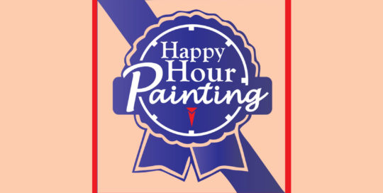
aantonopoulos@socal.rr.com 2017-05-25T12:29:55+00:00This was a fun and ongoing project. The owner of Happy Hour Paining is a close friend of mine and fine artist who started a business like Wine and Canvas called Happy Hour Paining. The premise behind Happy Hour Painting is to relax and learn how to paint while enjoying your favorite glass of Merlot [...]
Kafe Neo
Logo Design
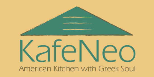
aantonopoulos@socal.rr.com 2017-05-25T12:18:31+00:00The KafeNeo was a corporate branding project that spanned from A-Z. Hired as the creative talent for the project, the client requested a complete brand identity to be established. KafeNeo is a play on words meant to have a double meaning. #1 KafeNeo – A new style of café’. #2 KafeNeo – In Greek is [...]
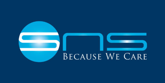
SNS Pharmaceuticals
Corporate Identity, Logo Design
aantonopoulos@socal.rr.com 2021-11-16T08:52:45+00:00SNS CEO approached me to develop a corporate identity and brand structure for their worldwide product lines. After meeting with the CEO and understanding the business model, we decided to push the identity thru the entire gamut of products retaining the SNS portion of the logo and swapping out color and tagline to ensure consistency [...]
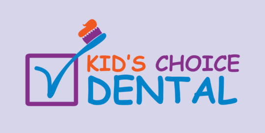
Kids Choice Dental
Logo Design
aantonopoulos@socal.rr.com 2017-05-25T13:13:01+00:00Stepping outside of my comfort zone with IT and corporate related branding, I took on the challenge of designing a logo for a dentist’s office specializing in kid’s orthodontics. Design direction provided by the client was minimal other than the logo should be “playful” and relate to kids. After a few design comps, the client [...]